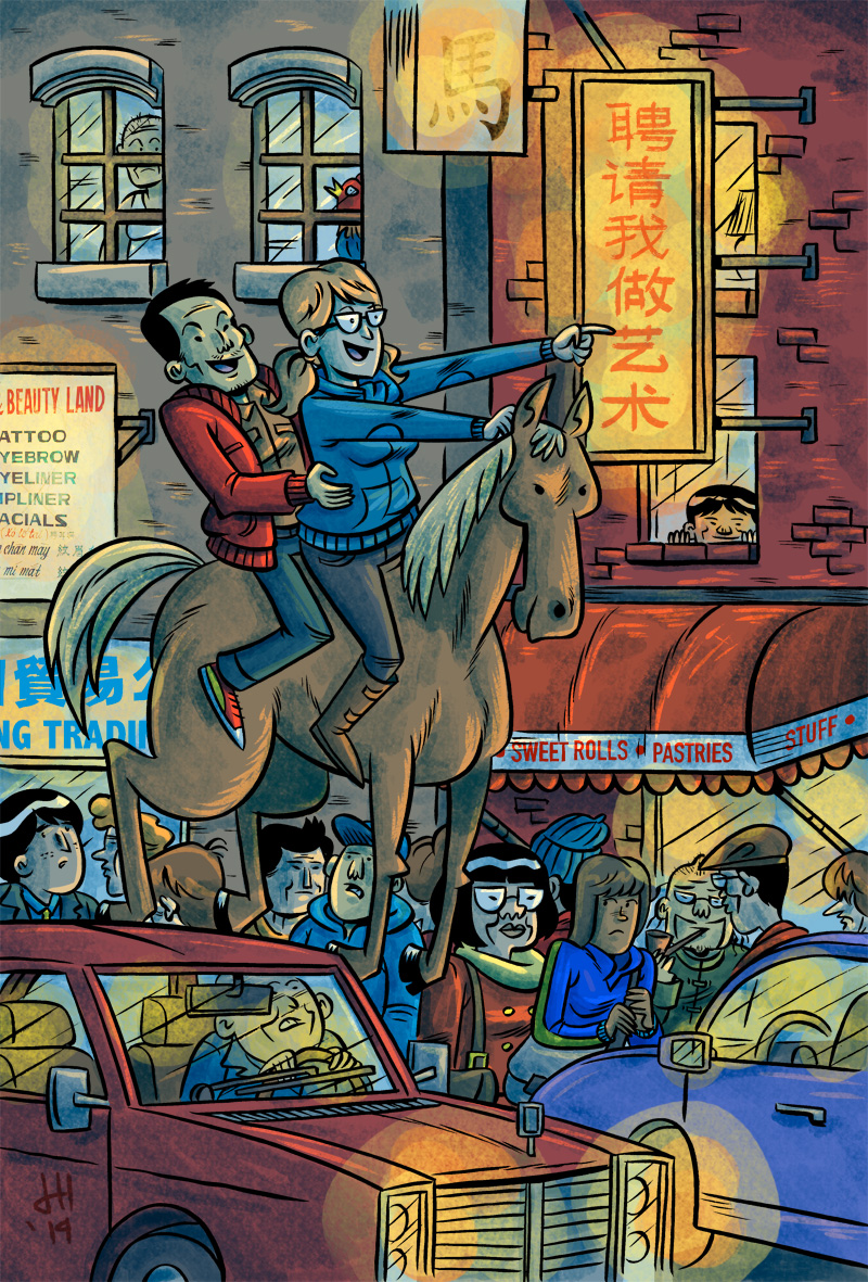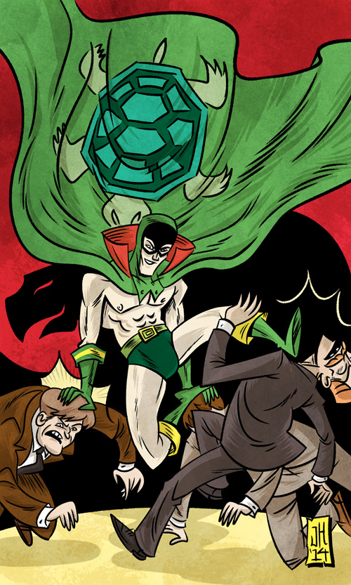
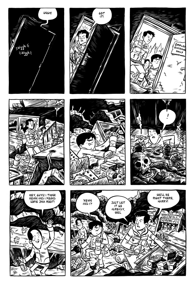
It’s just some Asian dude beating up some gangsters in his underwear, cape, and a cowl. OH WAIT. That’s the Green Turtle, from Gene Luen Yang and Sonny Liew’s The Shadow Hero! He’s the first Asian American superhero!
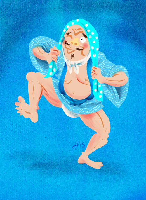
I was honored to be part of the amazing lineup of artists asked to participate in creating fan art for The Shadow Hero. If you get the chance, you really should look at the work the other artists did. There are some really amazing pieces.
I would have loved to have had The Shadow Hero around to read as a kid in the 80s. As an Asian-American [despite my totally white name, I’m half Vietnamese], there weren’t a whole lot of Asian characters that weren’t stuck being sidekicks to look up to when I was young. Outside of Bruce Lee and his movies [who was still stuck being a sidekick at one point in his career] and Dennis Dun’s Wang Chi in Big Trouble in Little China, who was there? I can’t even think of an lead Asian character in a comic book or cartoon from then.
Anyhow, what are you waiting for?! The book is out! Go pick it up at Powell’s or your local bookstore or comic shop! Or if you’re lucky enough to be in San Diego, go straight to the source and buy it from Gene Luen Yang at the First Second table at #1323!
 I’ll also have original art, and my backlog of mini-comics, including a new print version of the Titular Hero, a short comic MK and I did for Tor.com, and my other new mini-comic, The Littlest Littles.
 Things have been a little quiet lately as I’ve been cranking away at some comics trying to get them done in time for